Would you like to clean up your forms by displaying fields in multiple columns? WPForms makes it easy to split fields into halves, thirds, or even more complex column layouts.
In this tutorial, we’ll show you how to leverage our multi-column layout settings to help your forms look their best.
To open the layout setting, you can click on any field in the builder to open its Field Options screen. From here, you’ll need to open Advanced Options. Columns are configured using the CSS Classes setting.
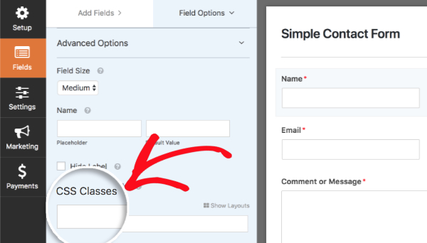
There are two ways to create layouts for your forms:
Add CSS Classes with Visual Layouts
It’s easy to structure your columns with our visual layouts tool.
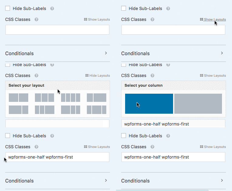
Here, we’ll discuss how to do this step by step.
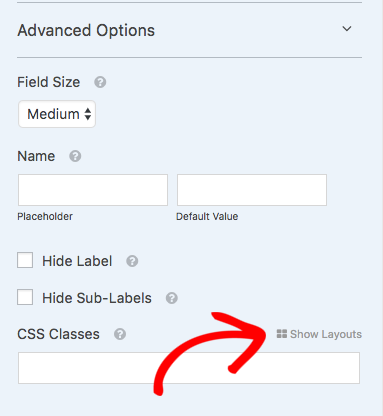
From the Advanced Options section of the Field Options screen, you can select Show Layouts to see all available column options.
We want our Name and Email fields to appear next to each other, and for each to take up half of the form width. For this layout, we’ll select the option that shows two even-sized boxes.
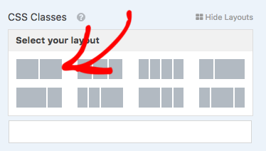
Once we select this layout, the next step is to choose where in the layout we want this field to appear. Since our Name field is first on our form, we want it to appear on the left column.
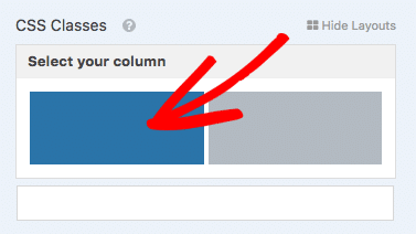
By clicking on a column, the corresponding classes are automatically added to our CSS Classes field. The wpforms-one-half class tells the field to take up half of the available width, while the wpforms-first class tells the field that it needs to start a new row.

Next, we just need to do this same process to put the Email field in the right column. When you’re done, be sure to save the changes in the form builder and you’re all set to publish the form on your site.
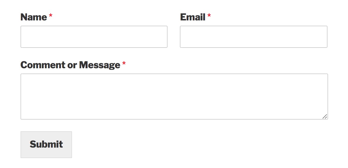
Here’s how the form looks with the multi-column layout on the frontend of the site:
Add CSS Classes Manually
If you would prefer not to use the visual builder, you can type in CSS classes manually instead.
Here are all of the available CSS classes for layouts:
- wpforms-one-half
- wpforms-one-third
- wpforms-one-fourth
- wpforms-one-fifth
- wpforms-one-sixth
- wpforms-two-thirds
- wpforms-two-fourths
- wpforms-two-fifths
- wpforms-two-sixths
- wpforms-three-fourths
- wpforms-three-fifths
- wpforms-three-sixths
- wpforms-four-fifths
- wpforms-five-sixths
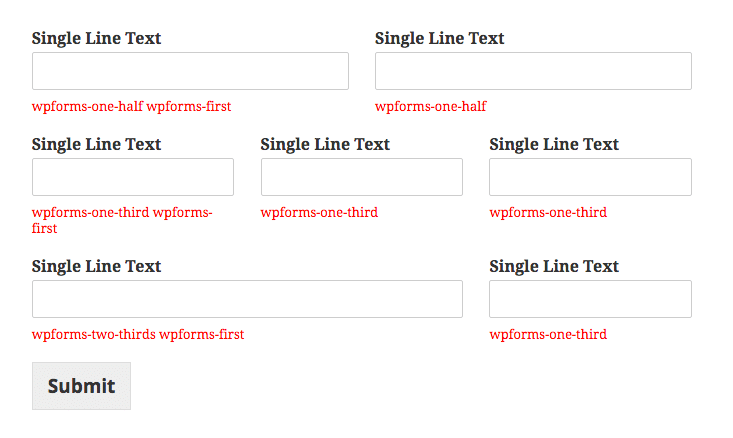
The image below shows three different common column layouts. The red text below each field CSS classes that were used from the list above. You can click the image for a larger view.
Additional Notes for Layouts
When using column classes there are a few things to note:
- Columns will display when viewing the form on the frontend of your site. The columns do not apply inside the form builder; however, that is something on our radar for the future.
- The first element in each row needs to have the
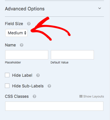
wpforms-firstclass in addition to the column class. This tells the plugin it is the first item and lets us reset any other previous columns in the form. - In most cases, when using the column classes you should set the Field Size(also under Advanced Options) to Large. This allows the field to fill all available space in its column and keeps right and left spacing even against neighboring fields.
That’s it! You can now optimize your form space with multi-column layouts.
Would you like your forms to also look great on mobile devices? You can absolutely configure your form to have a multi-column layout that changes to display fields in a single column on mobile, so your forms are beautiful and user-friendly on every device.

